
The three directions
A · B · CQuiet Confidence
Typographic and calm. Ink navy on warm paper with a copper accent. It reads like a steady professional who does not need to shout: nothing flashy, everything reassuring.
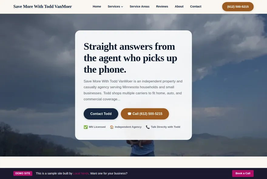
Workbench
Practical and checklist-driven. Spruce green on bone with one amber action button per screen. Coverage treated like honest craft: reviewed line by line, explained in plain words.
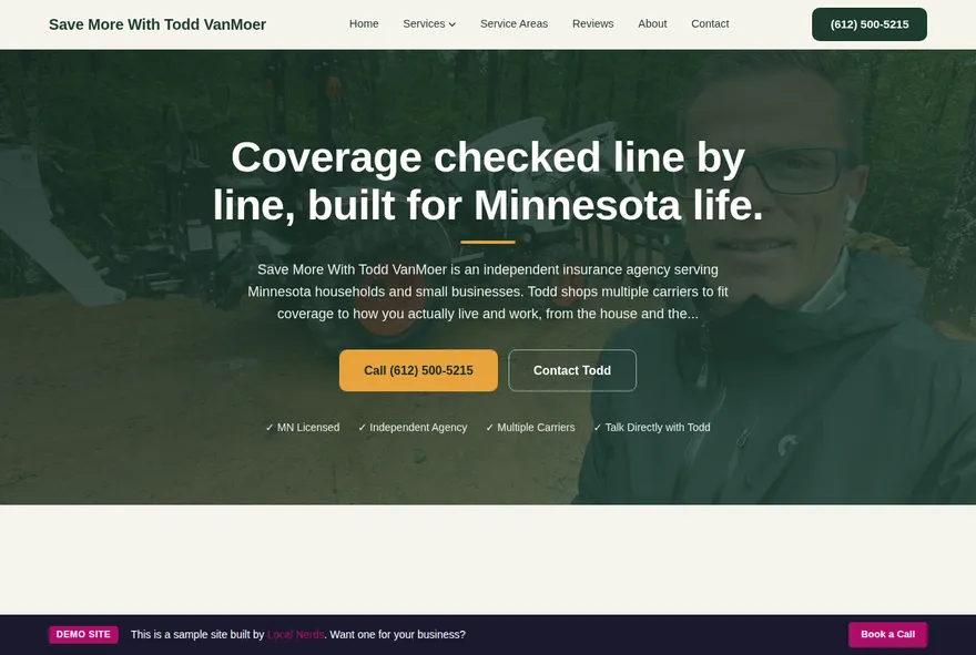
Wayfinder
Built around clear routes and helpful signage. Pine and lake blues on ice, with a single red call button per screen. For the visitor who arrives with a problem and wants the shortest path to an answer.
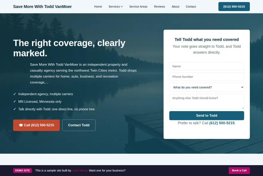
How to review
Fifteen minutes is plenty. You are choosing a look and feel, not proofreading.
Look on your phone and your computer
Most of your visitors will be on a phone, so check each demo on both. Every direction is built to work on any screen.
Go with your gut
Click around a few pages and notice what feels right and what feels off. Colors, type, and layout are the decision here.
Skip the fine print for now
Sample reviews and placeholder details are labeled inside each demo. They get replaced with your real content in the build-out.